Beryl Scoot Happy
Launching an e-scooter safety-training website
- Animation
- Branding
- UX
- Visual Identity
- Website Design
- Website Development
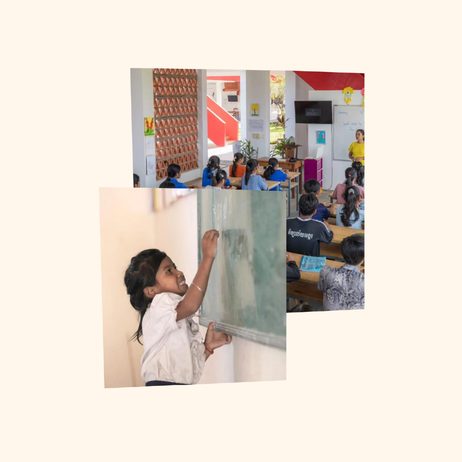
To rebrand and redesign the Kulen Outreach website, to better promote and tell the story of bringing quality education to the rural areas of Northern Cambodia. To refresh the visual look and feel in order to better reflect the modern, bright and positive appearance of the schools they are building in the area.
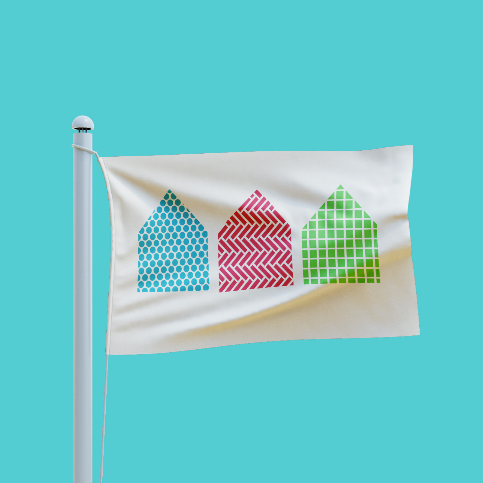
Inspired by the incredible architecture of the schools constructed and funded by Kulen Outreach, our rebrand brings a fresh and colourful outlook to a well-loved charity. Taking cues from the unique textures and structural details of the Kulen Outreach-built schools, inspired by the ancient Khmer architecture, we set about creating a brand that moved beyond an educational angle. Transforming it into a brighter and more positive brand, we injected some much needed colour and creativity to really help Kulen Outreach stand out amongst their contemporaries.
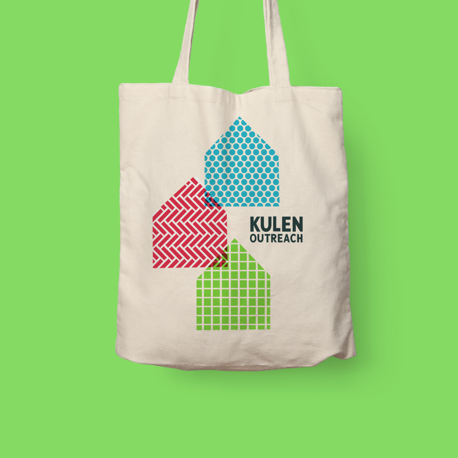
Our goal was to visually redesign the website and also to raise the bar technically and rebuild it to the highest standard.
Inspired by the colours and textures of Northern Cambodia, we redesigned the Kulen Outreach website to be more colourful, playful and creative, reflecting the values of the schools themselves. For the build, we created a new theme from scratch, adding extensive custom-built content options, as well as making sure the website is quick, fully responsive and accessible to all.
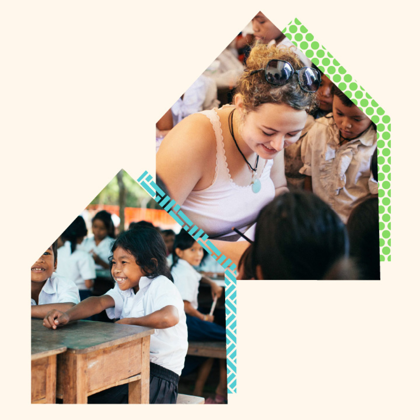
A brand and website that reflects the new direction for Kulen Outreach and has greater appeal to volunteers, donators, the team, local community and social media followers. We delivered a more modern and contemporary look whilst retaining the sustainability, trust, reputation, innovation and community values of the brand.
